My contribution
I worked as a Product Designer with two Product Managers, a CPO, an analyst and developers. My work covered user flows, prototypes, detailed interfaces and service states. I used the analyst’s weekly reports to discuss funnel friction with the team and translated product decisions into assessment, purchase and ongoing-care experiences.
How iHairium works
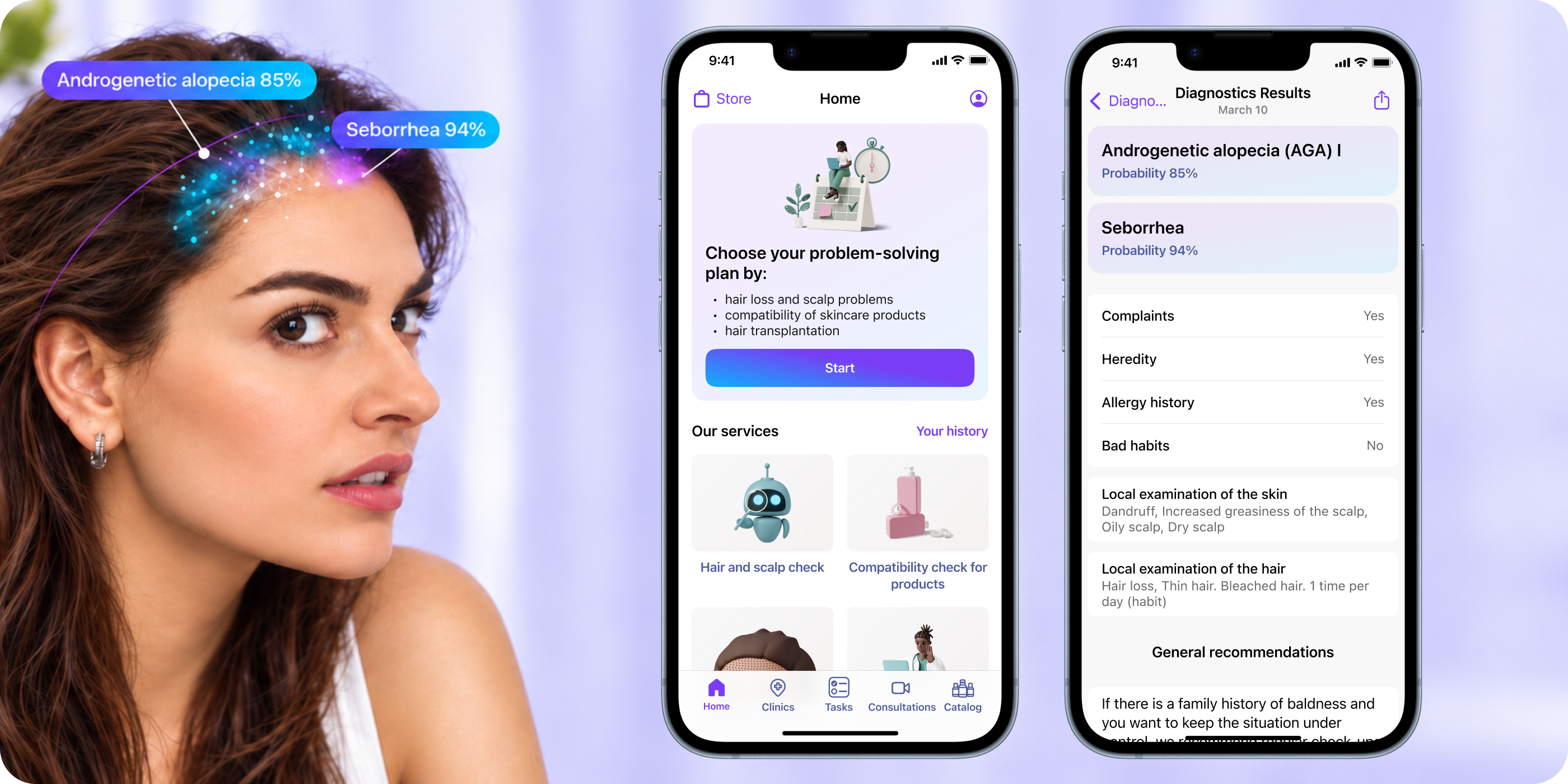
Users answer questions, provide assessment inputs and receive a result with care recommendations. They can explore suitable products and record changes over time. As the product evolved, the design connected this starting point with scheduled consultations, analysis interpretation and daily care tasks.
Help users get results with less work
After launch, analytics showed users dropping out during the assessment. We reviewed the questionnaire with medical experts and reduced the number of questions by 40%. I redesigned the shorter flow and moved additional questions into Home cards, so the product could collect more context after the initial assessment.
- questions in the initial assessment
- −40%

Offer an alternative to difficult photo capture
Taking hair and scalp photos from several angles added effort. I designed guided video capture and a rotatable 3D model that users could adjust to match their hair-loss pattern. After comparing the alternatives, the team chose the 3D direction. The proposed flow kept photographs optional, allowing users to continue without completing every photo step.
- reduction in average assessment time
- −42 seconds
 Explored: guided videoSelected: 3D model
Start with what the user needs
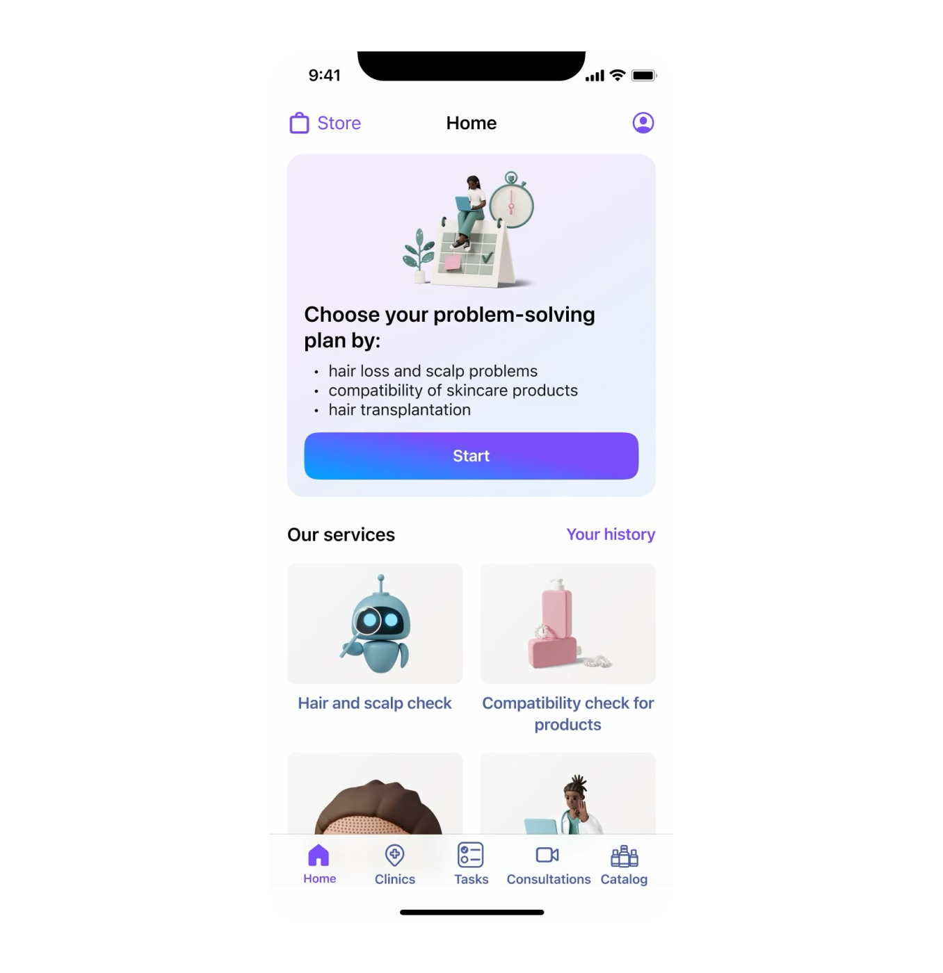
Shortening a single questionnaire did not address every user’s goal. I designed entry points for hair and scalp assessment, product selection and hair transplantation. Each branch could ask for relevant information and lead to a different next step, instead of sending everyone through the same broad assessment.
 Hair and scalp assessmentProduct selectionTransplantation
Connect assessment with specialist care
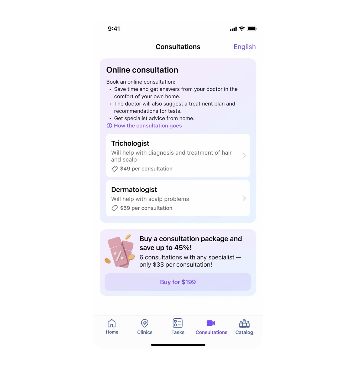
In the first version, users contacted specialists through external messengers. I designed a dedicated consultation flow with specialist profiles, available time slots, payment and booking confirmation. Appointment details explained how to join the call, while completed consultations kept the specialist’s conclusion accessible in the user’s history.
Integrate subscriptions with one-off services
The early product offered subscription access. As individual services were added, I designed flows that combined subscription allowances with separate purchases. The interface had to distinguish what was included, what had been used and what could be bought again. I also designed purchase confirmation, failed-payment and recovery states.

Turn recommendations into a routine
The original photo diary helped users observe changes. The later task tracker supported acting on recommendations: users could choose activities, read instructions and organize them into daily, weekly and monthly routines. I designed task selection, reminders and completion states to support continued use after the assessment.
 Choose a routineDaily and weekly tasksFollow and complete tasks
Outcome and lessons
The first release led us to revisit the assessment, payment model and path into further care. We reduced the questionnaire by 40% and designed goal-based journeys, individual-service purchases and ongoing-care tools. The original product direction did not achieve the traction the business needed. I no longer have reliable historical figures to quantify conversion or retention changes.
A product can need more information without needing all of it upfront.