The product
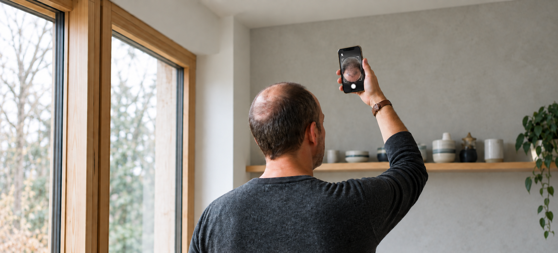
iHairium started with a proposition: help people assess the condition of their hair and scalp, receive personalized recommendations, and find suitable care products.
The first version connected several parts of that journey. Users completed an assessment questionnaire and uploaded photographs, received personalized recommendations, browsed suitable care products, and could track changes over time.
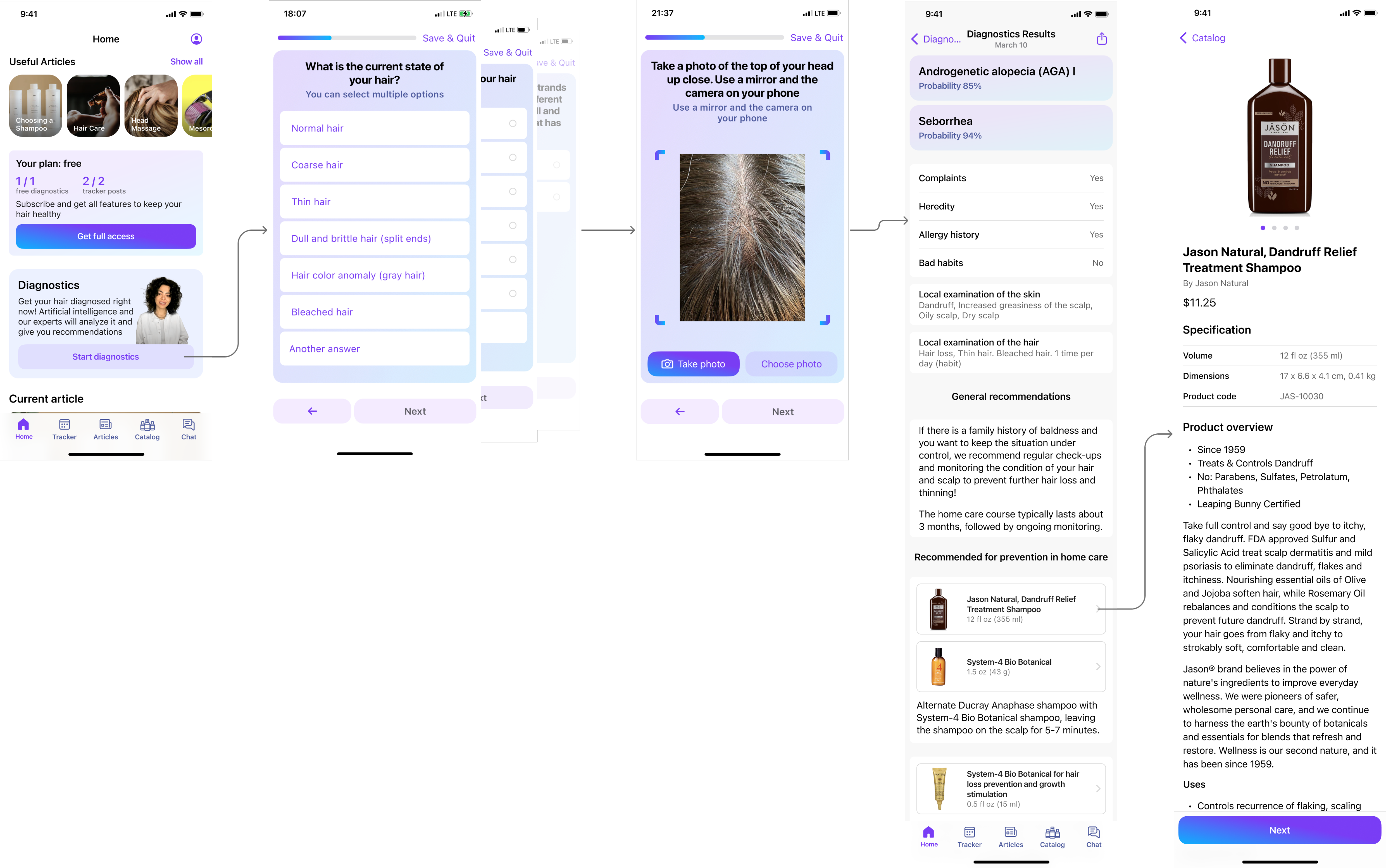
The product catalogue also linked users to external retailers, while a subscription provided access to assessment and tracking features. Communication with specialists initially happened through external messengers.
My role
I worked as a Product Designer alongside two Product Managers, a CPO, an analyst, and the development team.
I translated product requirements and research into user flows, interaction models, prototypes, and production-ready interfaces. As the product evolved, my work moved beyond the initial release into funnel improvements, monetization, consultations, service states, and ongoing-care scenarios.
The analyst joined during the project and introduced event tracking and weekly reporting. These reports became an important source for discussions about where users were struggling and what we should change.
What we learned after launch
The first release gave the team something we had not had before: real behavioral data.
Sales remained low, and analytics showed users dropping out during the assessment journey. The questionnaire stood out as an important source of friction.
The experience required users to provide a substantial amount of information before receiving anything useful in return. At the same time, the product also had to explain why a user should continue into paid care once the assessment was complete.

Getting users to value earlier
To shorten the assessment, we asked medical experts to review the questionnaire and help identify which questions were essential for the first result.
Together, we reduced the number of questions by 40%, making the initial assessment less demanding. The aim was to help users reach their recommendations with less effort, rather than asking them to complete a lengthy questionnaire upfront.
Reducing the effort of photo capture
Photo capture created another source of effort in the assessment. Taking photographs of the hair and scalp from multiple angles was time-consuming, so shortening the questionnaire alone would not resolve the whole problem.
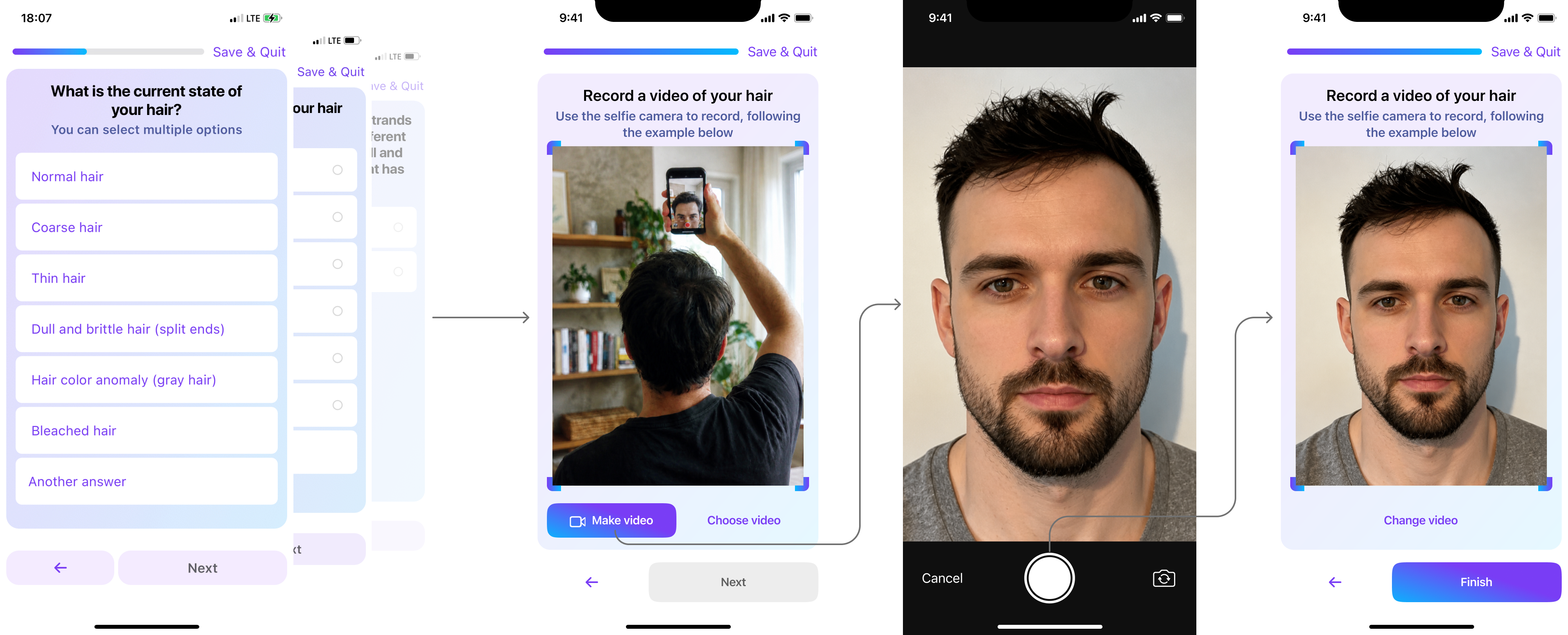
We explored video as an alternative to a series of photographs. The flow provided an example, let users record or upload a video, and allowed them to review and replace it before continuing.
Another approach asked users to select a 3D model that matched their hair-loss pattern and severity. They could rotate the model and use a slider to adjust the degree of hair loss.
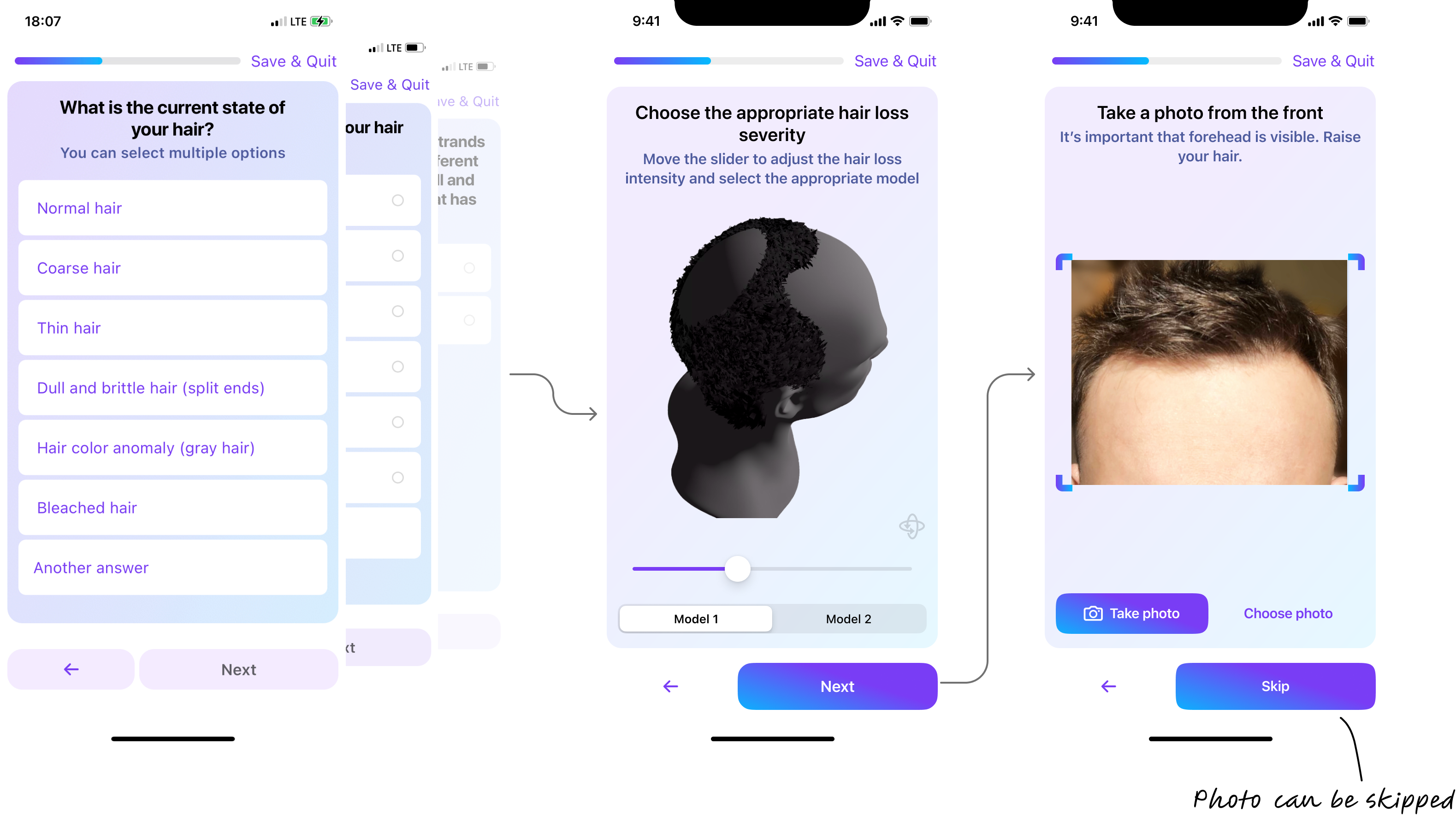
The team chose the 3D-model approach. In our comparison, it produced more accurate assessment results than video, while video was also difficult for users to record.
The proposed flow kept photographs as an additional input, but allowed users to skip the photo steps. This gave users a way to continue with 3D selection without making photo capture a prerequisite.
Starting with the user’s goal
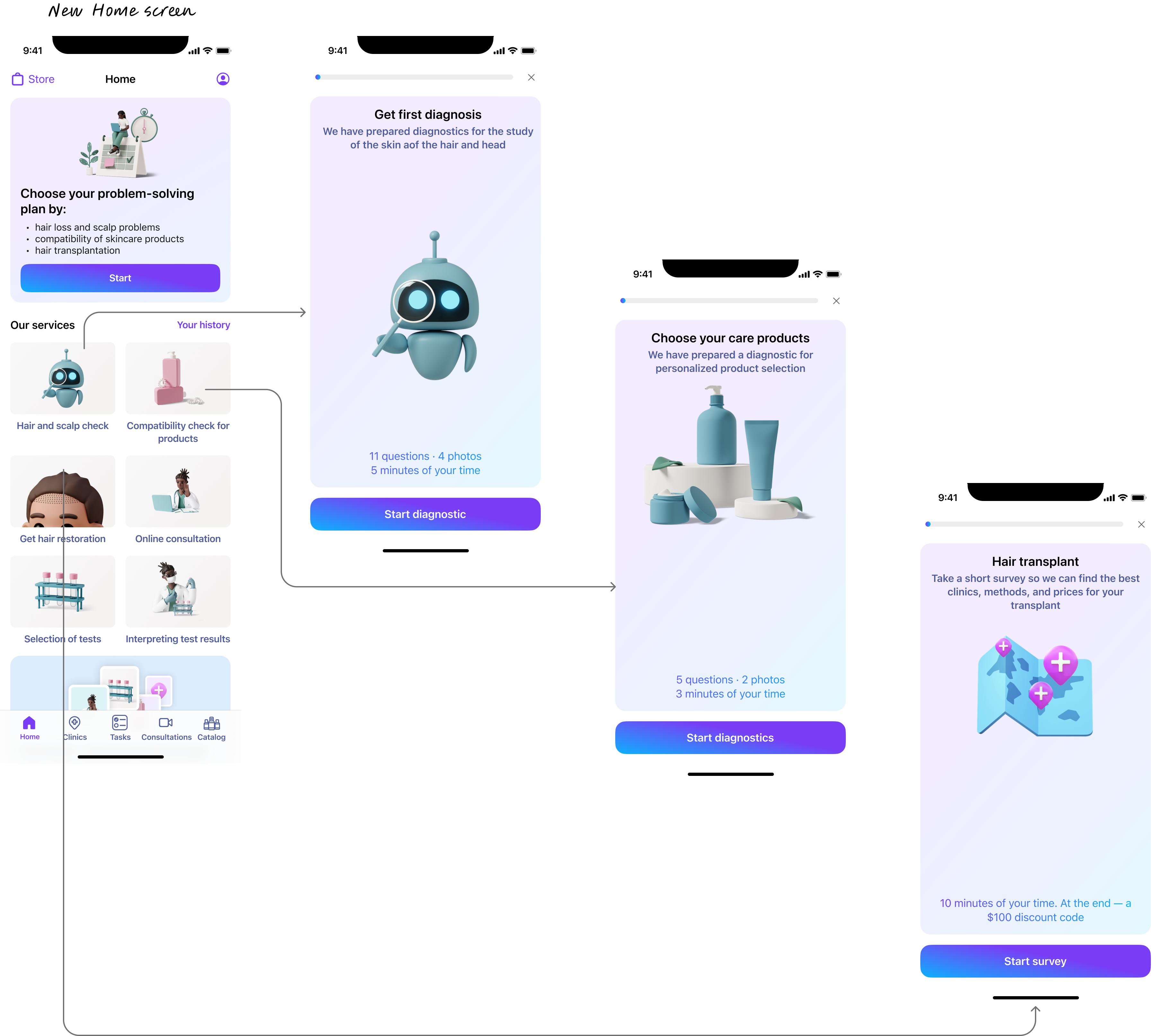
Another iteration went deeper than shortening the questionnaire. Instead of assuming that every user needed the same assessment, we asked what they wanted help with first.
The entry point distinguished between concerns such as hair condition, scalp condition, a broader assessment, and hair transplantation.
This gave us a basis for different journeys: someone looking for suitable care products did not necessarily need the same questions or next steps as someone considering transplantation or seeking professional advice.
That distinction became increasingly important as iHairium expanded beyond a single assessment flow into consultations, analyses, clinic selection, and other services.
Rethinking paid care
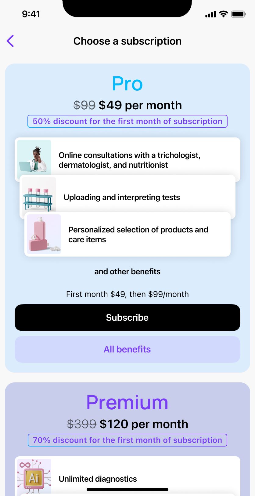
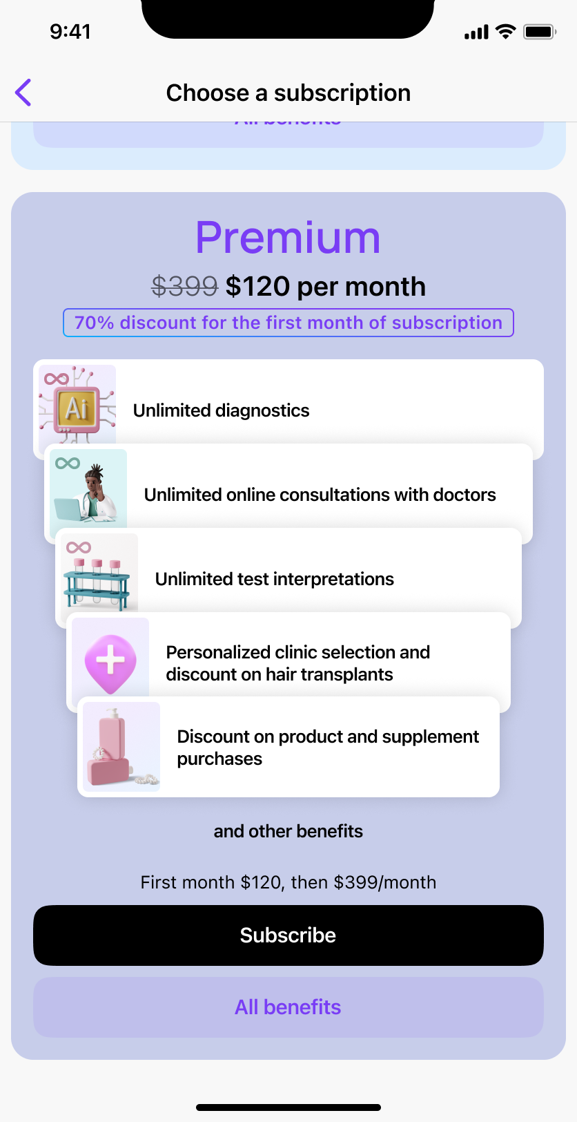
The early product relied primarily on subscriptions.
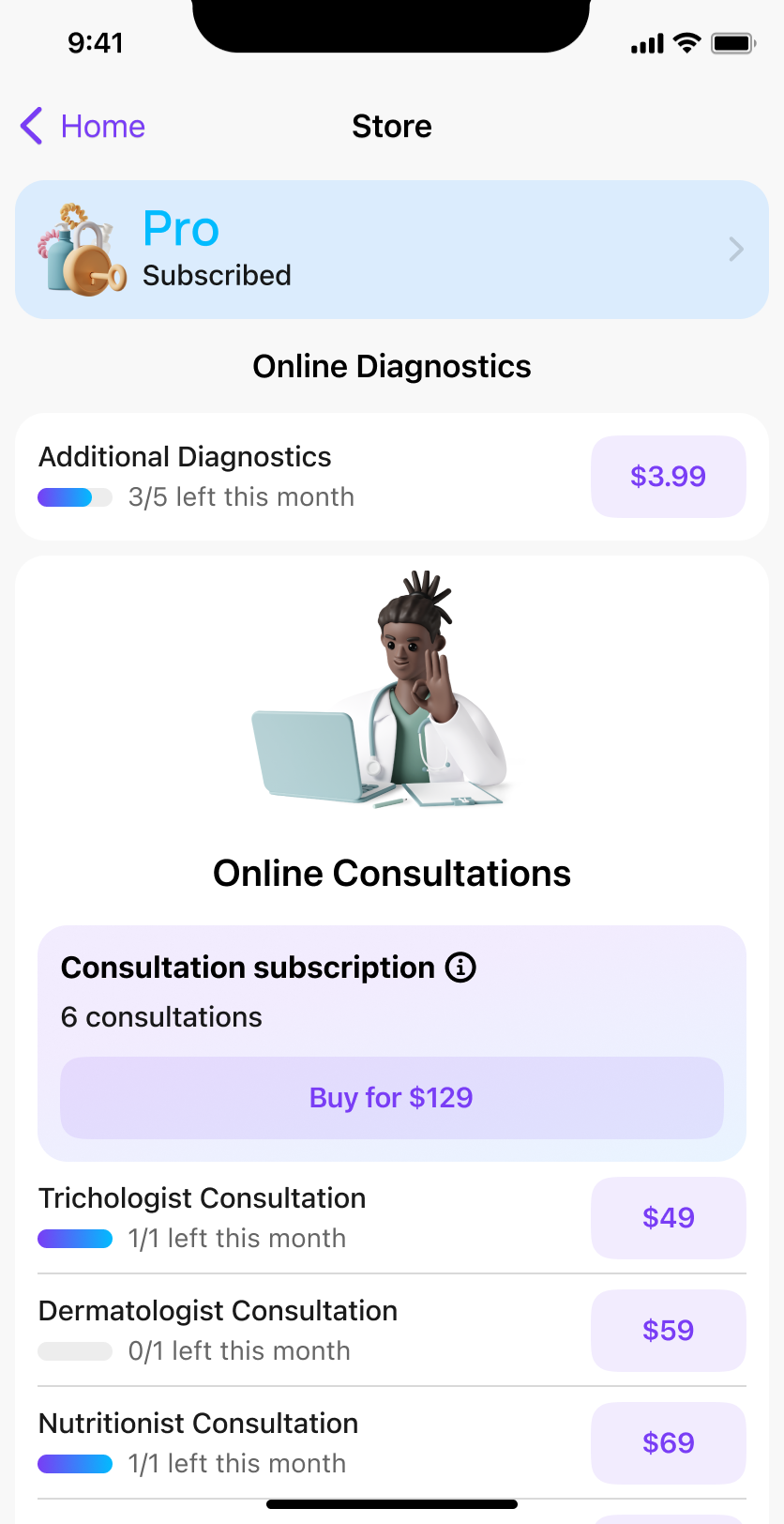
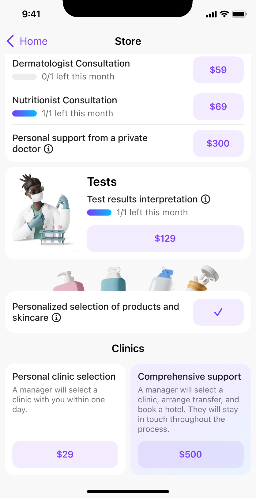
As the offering developed, the team introduced a services store where users could purchase individual services such as additional assessments, consultations, and interpretation of analyses.
This created a different model of access.
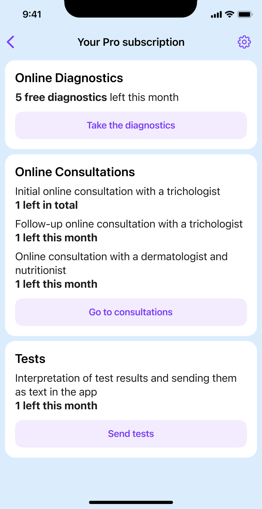
A subscription could support an ongoing relationship with the product, while a separate purchase could solve an immediate need. For example, a user who had already consumed the assessment included in their plan could purchase another one without changing their subscription.
That flexibility created a new interaction-design problem: the interface had to explain the difference between what was included, what had already been used, what remained available, and what could be purchased separately.
I designed states for free users and subscribers, available and consumed services, purchase confirmation, and payment recovery.
Connecting recommendations to further care
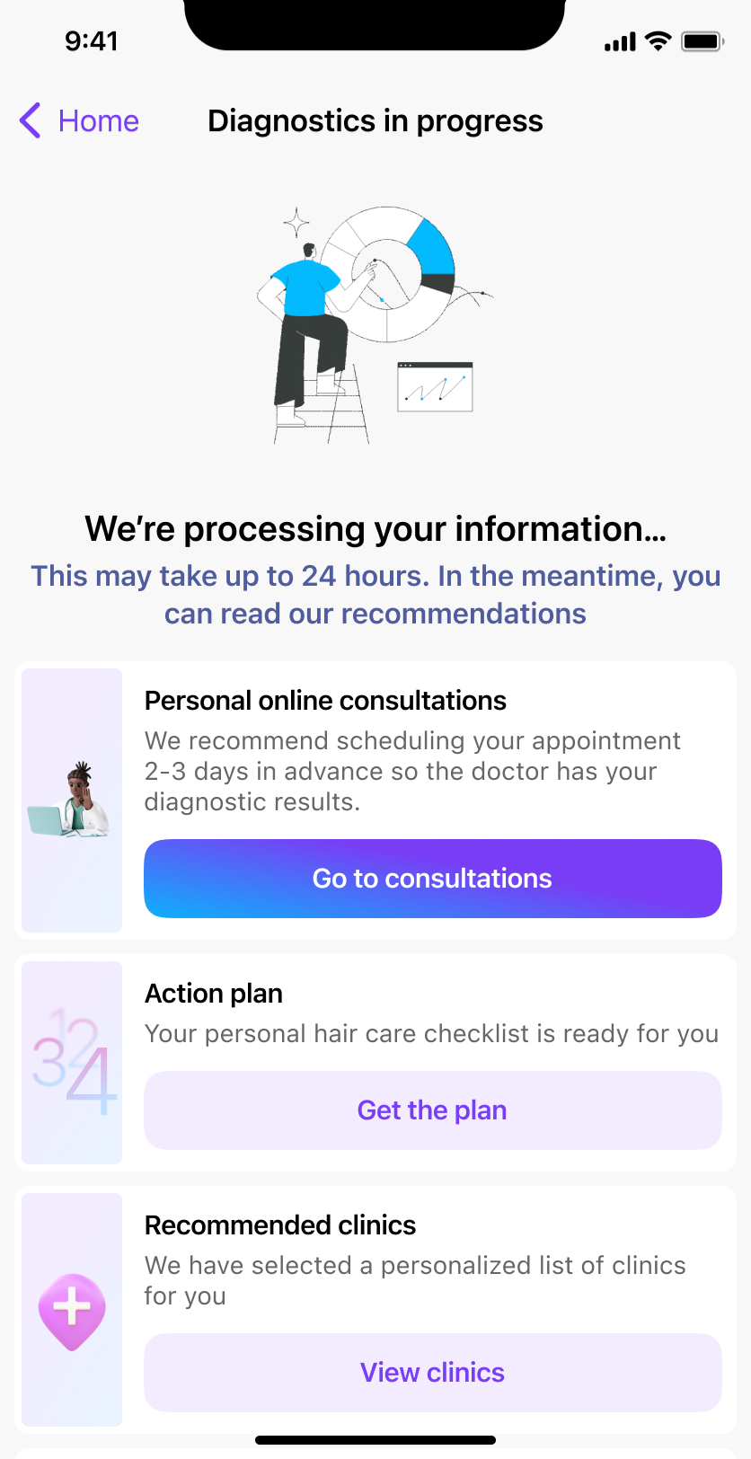
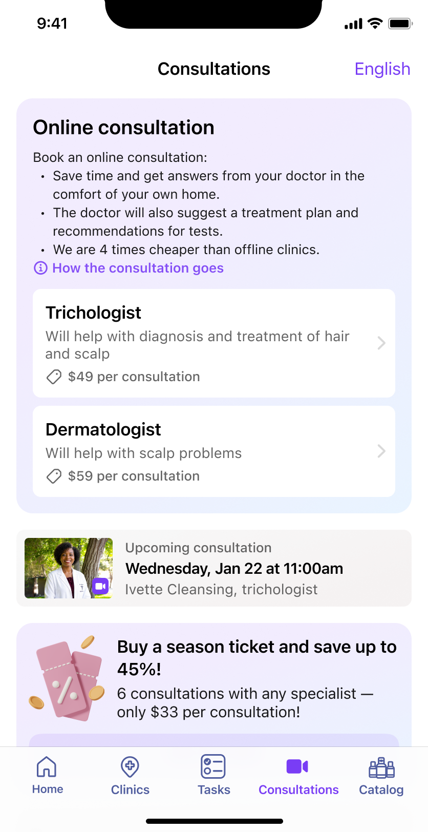
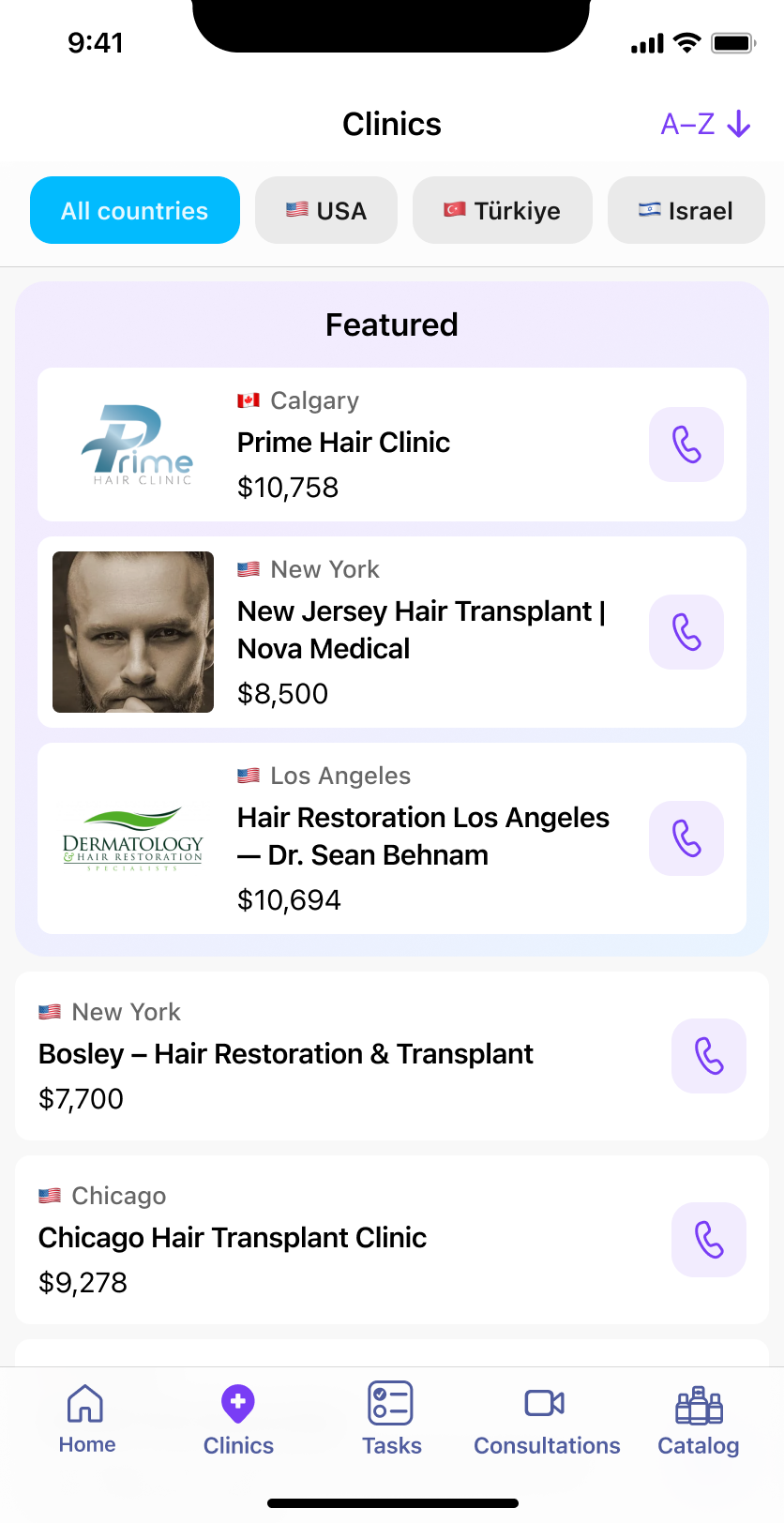
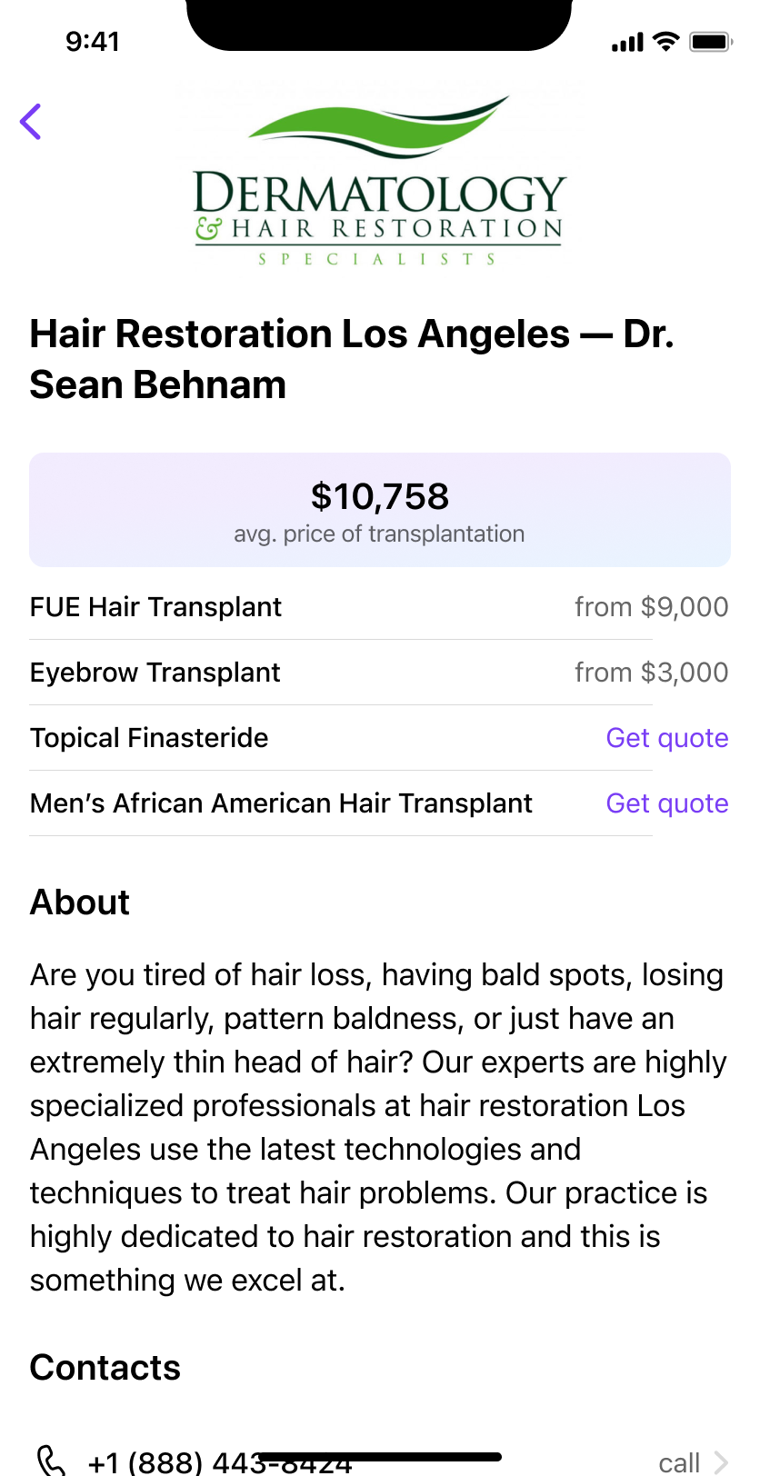
As the second version took shape, the product expanded into consultations, analyses, clinic selection, and additional services. The design work increasingly concerned the connections between those services. An assessment could lead to a consultation; a consultation could require further information; a user considering transplantation could continue into clinic selection.
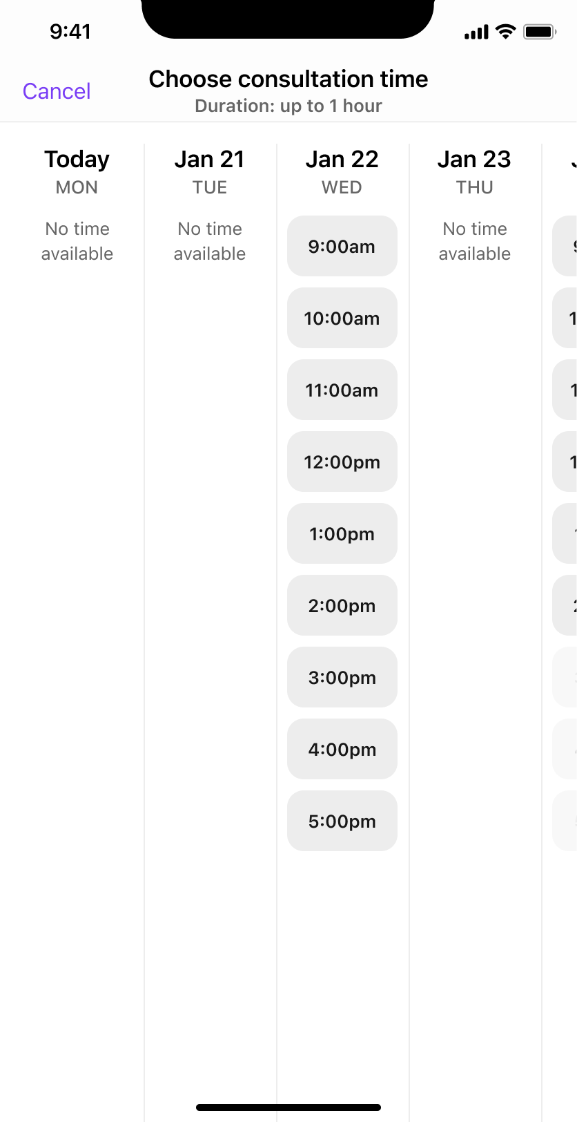
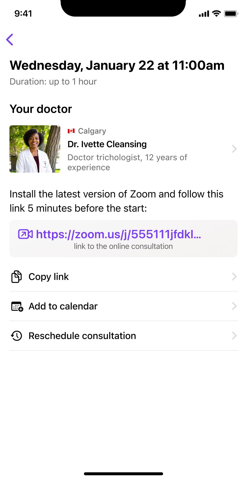
The consultation flow developed beyond a simple contact action. It included choosing a specialist and time, confirming a booking, payment, and the states surrounding the appointment.
A medical-card area brought assessments, analyses, and consultations into a shared history. The aim was to keep previous results and upcoming actions accessible as users moved between services.

From recording progress to supporting a routine
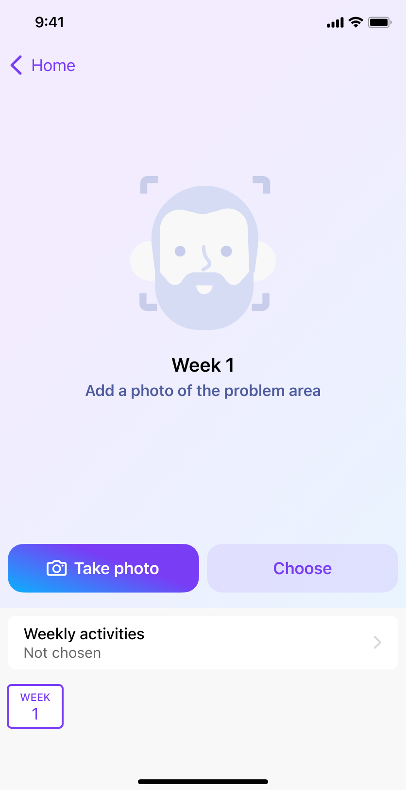
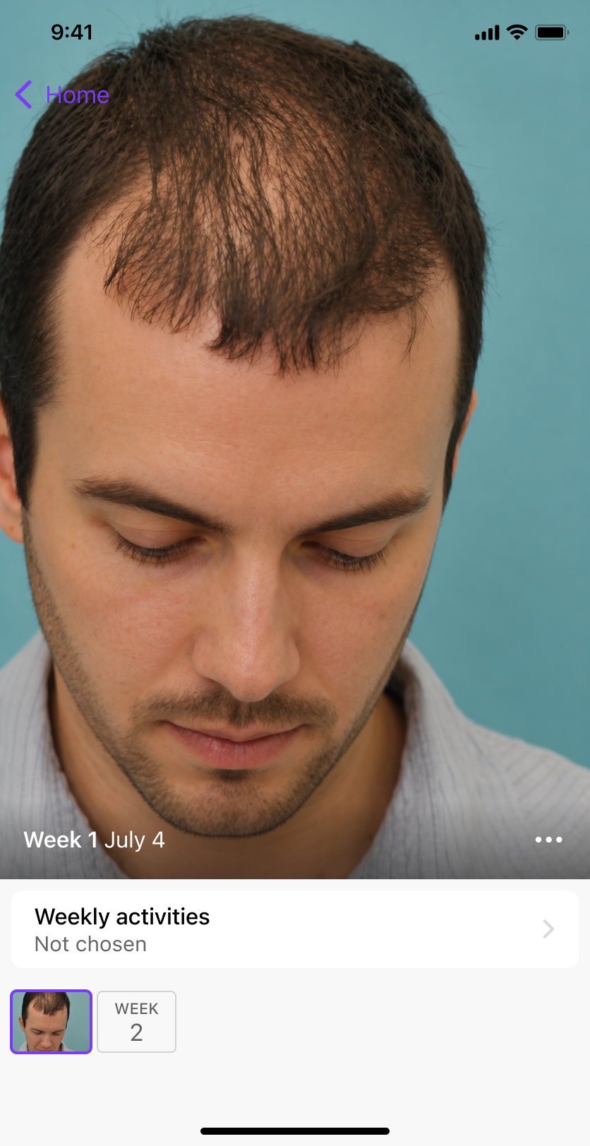
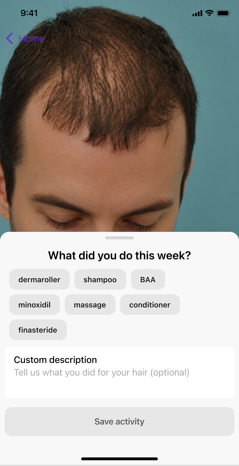
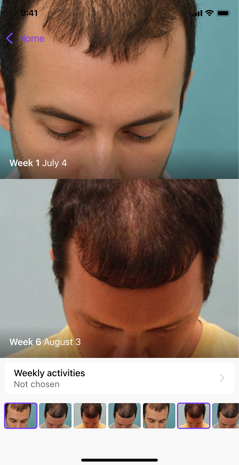
The original photo diary supported observation: users recorded how their hair looked over time.
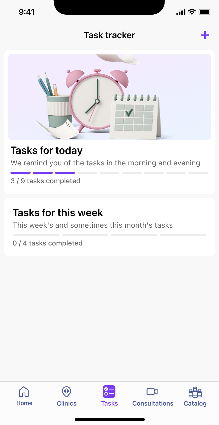
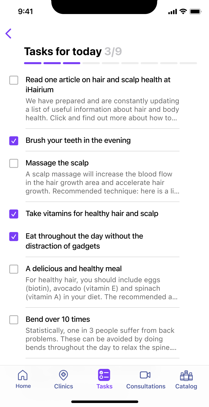
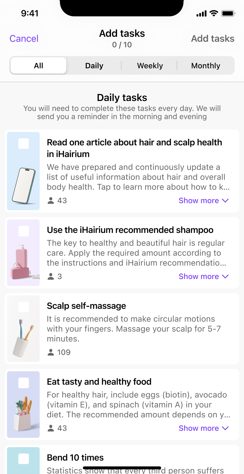
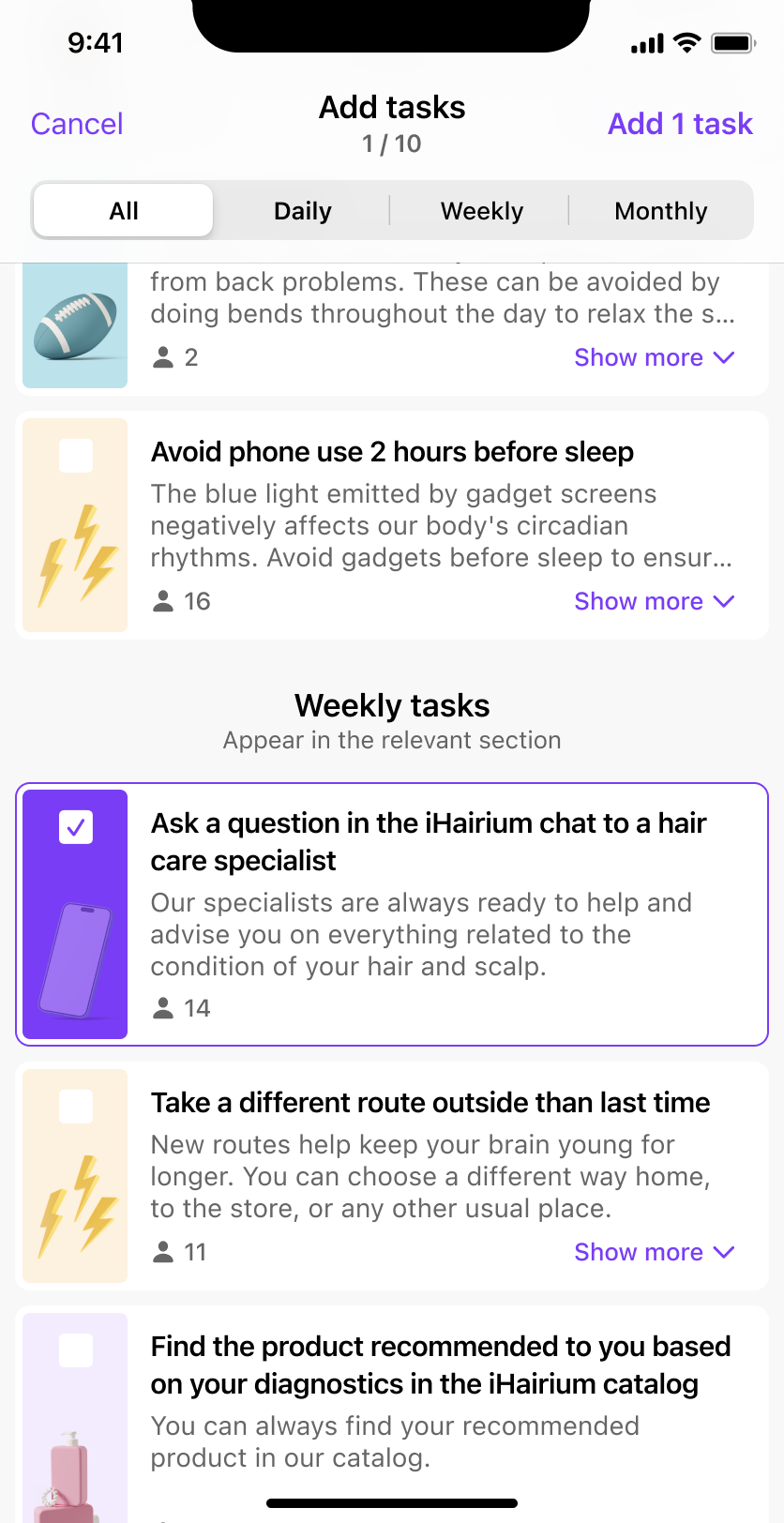
The later task tracker addressed a different activity—following a routine. It organized suggested actions into daily, weekly, and monthly groups, with task selection, instructions, reminders, and completion states.
This extended the interaction beyond receiving and storing recommendations. Users could turn selected actions into an ongoing list and return to it during the week.
Photographic history and task completion served different purposes, even though both supported continued use.
The task tracker also supported product engagement metrics. Recurring tasks, reminders, and completion states gave users a reason to return after receiving their recommendations, with the potential to improve repeat sessions, weekly retention, and the number of completed care activities.
Outcome
The first release gave the team real behavioral evidence and changed how we approached the product.
Instead of treating the original assessment flow as fixed, we reduced the amount of information required upfront, introduced goal-based journeys, expanded payment options, and connected assessments with further care.
The product evolved from a relatively linear assessment experience into a broader system connecting recommendations, consultations, services, history, and ongoing care.
From a business perspective, the work focused on three connected metrics: assessment completion, conversion from a result into a subscription or one-off service, and retention through continued care. Expanding the offering also created more opportunities for repeat purchases and increased customer lifetime value. However, the original product direction did not reach the traction the business needed, and I no longer have reliable historical figures to quantify the impact of individual changes.
What I learned
The project changed how I think about the relationship between information, value, and timing.
A product can need a large amount of information without needing all of it now. Asking users to complete the system’s requirements before giving them something useful creates friction even when every individual question seems justified.
Most importantly, working with the product after launch made the difference between a plausible design and an informed one visible. The first release was not the end of the design process; it was the point where we could start seeing which assumptions actually held up.